Every year, I like to do a Steel Magnolias themed shoe. Last year and the year before, it was the 25th Anniversary of the film and the stage version, respectively so I did pink shoes with silver accents (because it would've been Shelby and Jackson's silver anniversary).
My 2014 Steel Magnolias shoe is here
My 2013 Steel Magnolias shoe is here
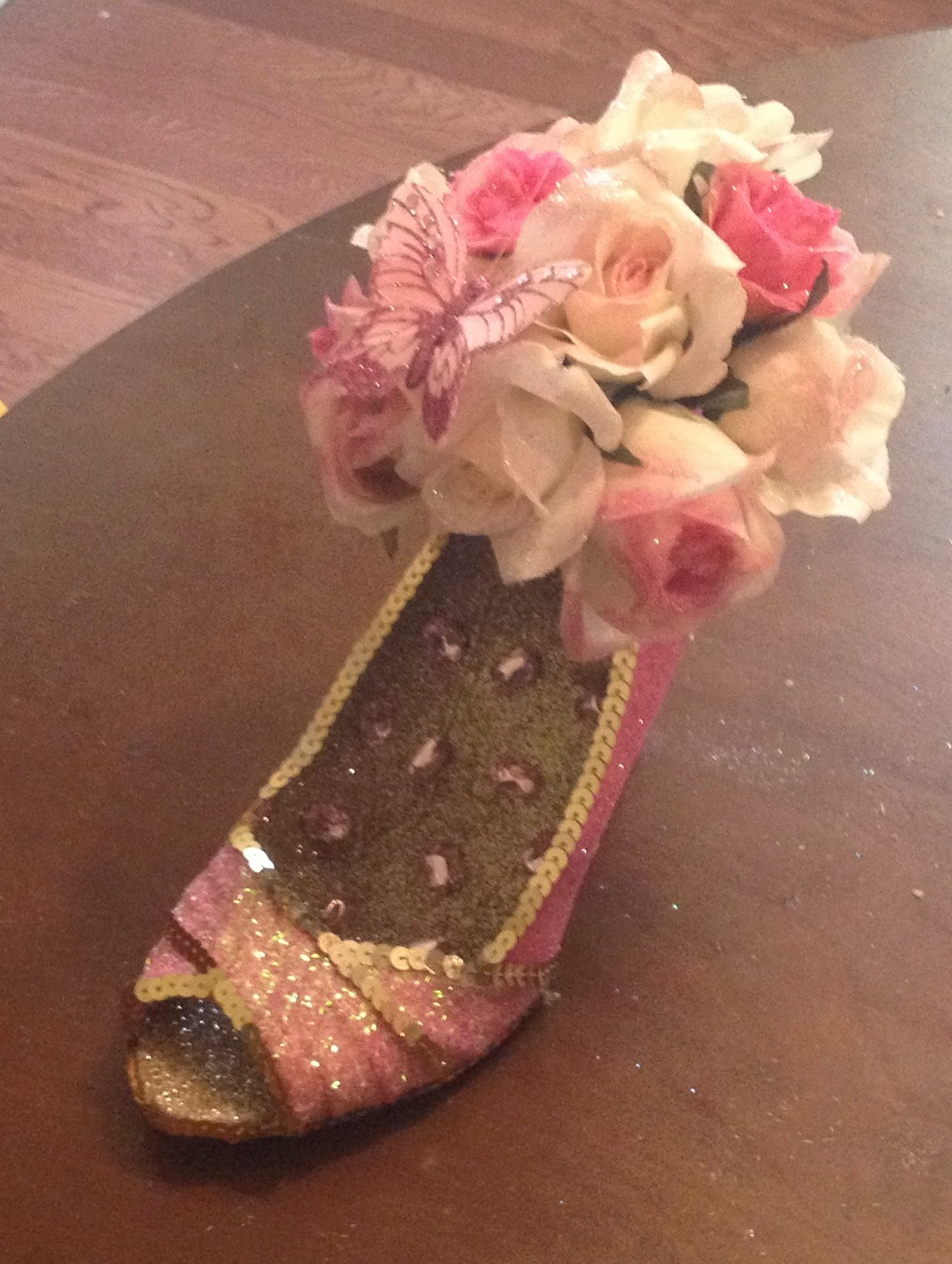
This year, I once again did a pink and pink (I mean..."blush and bashful") color scheme, but I went with gold accents and I did a spin on Shelby's bouquet. Stylistically, it's a little modern for a late '80s bride, but I like to think Steel Magnolias is timeless and that this is the bouquet Shelby would pick out if she was getting married tomorrow or, at the very least, a Muses shoe she'd be pleased to catch in February.
The interior of the shoe is Recollections "champagne." The heel/sole of the shoe are Martha Stewart "copper." The exterior of the shoe is primarily Martha Stewart "cotton candy" and the foot straps are the tinsel cut of Recollections "blush" which I used last year. The edges are lined in gold sequin trim. The lettering (Muses on one side, 2015 on the other) is Scribbles "white mist" with Martha Stewart "bubble gum" over it.
The bouquet is a mix of different flowers I picked up over time, including some pale pink roses and some of the Spring floral bunches I picked up 70% off this summer. I added a little glitter to the flowers (three shades of pink). I also added a pink butterfly perched on the bouquet and sprinkled some lovely emerald-cut pink rhinestones in the interior of the shoe for a little extra punch of tickled pink.
The pictures aren't fantastic (it was a little gray out so the light wasn't really bright enough for the flash-free pics to come out well, and with the flash they always look a little weird), but with a new baby in the house, they'll have to do for now!
109 days left!! Nearly into the double digits. How's everyone else's shoeing going?
Saturday, October 25, 2014
Thursday, October 23, 2014
FAQ - How do you do the lettering on your shoes???
I only really have one Frequently Asked
Question, which is “How do you do the lettering on your shoes?” To save myself the trouble of writing out
my answer over and over, I thought I’d put together one write up and link to it
whenever the question comes up:
Every shoe I do needs to have “Muses” and the year on it before it’s considered finished. I’ve gotten better at doing the lettering the more I practice, but even so I was tired of having to re-do lettering if I wasn’t happy with it the first time, so I ultimately switched over to doing a transfer approach. Transferring takes a little more time, but compared to writing directly on the shoe, you get cleaner lettering and more control over placement/spacing.
I developed this transfer technique for doing glitter appliques. I've blogged about it, in greatest detail here:http://glitteringshoes. blogspot.com/2013/06/ transfers-mini-how-to-guide. html
Essentially, I write letters on a ziploc bag in Scribbles paint then shake glitter over the lettering while the paint is still wet enough to hold the glitter. I let it dry overnight (sometimes longer if the paint is really thick) and then the letters peel right off the ziploc. If they don't peel cleanly, the paint probably isn't totally dry – I’d wait a little longer, especially if the paint was thick. Then I glue them on the shoe with E6000. The nice thing about the transfer technique is you can try out how you want the letters spaced before you glue them down.
I usually free hand the lettering these days, but it's also really handy to print out letters, put the paper inside the ziploc bag and trace, especially when you're matching a specific font or logo. For example, I using tracing for the "Roman Chewing Candy" letters for this shoe: http://www.pinterest.com/pin/ 535013630704521662/
In the beginning tracing is a big help. A modification of the tracing approach is to put graph paper inside the Ziploc bag and use the grid to guide your lettering. I use graph paper to make NOLA tiles on shoes like these: http://www.pinterest.com/pin/535013630706930710/ I make the tile lettering in two steps: first I make the background squares, let those dry, then add the letters on top.
I pretty much only use Scribbles 3-D paint for the lettering. It's got a good viscosity and doesn't collapse when it dries. I usually buy them when Michael's is offering a 25% off total purchase coupon because they rarely go on sale and the little individual bottles are too cheap to be a good use of a 40% off coupon. Another good approach would be to use a Michael's 40% off coupon on one of the 6-packs. I've also bought variety packs on Amazon: Variety Pack of Scribbles paint on Amazon
I like to do 2 or 3 iterations of anything I'm transferring so if something gets a little smudged on one or doesn't look quite right when it dries, I can pick out the best of the bunch. Some of the links in my Techniques Pinterest board cover similar approaches: http://www.pinterest.com/ shoeglitternola/techniques/
If you have any questions, or anything that you're not clear on, please leave a comment here and I’ll edit this write-up. When I get more time (not super likely to be any time soon with a newborn in the house), I may add some pictures, but I promise it's very simple.
Every shoe I do needs to have “Muses” and the year on it before it’s considered finished. I’ve gotten better at doing the lettering the more I practice, but even so I was tired of having to re-do lettering if I wasn’t happy with it the first time, so I ultimately switched over to doing a transfer approach. Transferring takes a little more time, but compared to writing directly on the shoe, you get cleaner lettering and more control over placement/spacing.
I developed this transfer technique for doing glitter appliques. I've blogged about it, in greatest detail here:http://glitteringshoes.
Essentially, I write letters on a ziploc bag in Scribbles paint then shake glitter over the lettering while the paint is still wet enough to hold the glitter. I let it dry overnight (sometimes longer if the paint is really thick) and then the letters peel right off the ziploc. If they don't peel cleanly, the paint probably isn't totally dry – I’d wait a little longer, especially if the paint was thick. Then I glue them on the shoe with E6000. The nice thing about the transfer technique is you can try out how you want the letters spaced before you glue them down.
I usually free hand the lettering these days, but it's also really handy to print out letters, put the paper inside the ziploc bag and trace, especially when you're matching a specific font or logo. For example, I using tracing for the "Roman Chewing Candy" letters for this shoe: http://www.pinterest.com/pin/
In the beginning tracing is a big help. A modification of the tracing approach is to put graph paper inside the Ziploc bag and use the grid to guide your lettering. I use graph paper to make NOLA tiles on shoes like these: http://www.pinterest.com/pin/535013630706930710/ I make the tile lettering in two steps: first I make the background squares, let those dry, then add the letters on top.
I pretty much only use Scribbles 3-D paint for the lettering. It's got a good viscosity and doesn't collapse when it dries. I usually buy them when Michael's is offering a 25% off total purchase coupon because they rarely go on sale and the little individual bottles are too cheap to be a good use of a 40% off coupon. Another good approach would be to use a Michael's 40% off coupon on one of the 6-packs. I've also bought variety packs on Amazon: Variety Pack of Scribbles paint on Amazon
I like to do 2 or 3 iterations of anything I'm transferring so if something gets a little smudged on one or doesn't look quite right when it dries, I can pick out the best of the bunch. Some of the links in my Techniques Pinterest board cover similar approaches: http://www.pinterest.com/
If you have any questions, or anything that you're not clear on, please leave a comment here and I’ll edit this write-up. When I get more time (not super likely to be any time soon with a newborn in the house), I may add some pictures, but I promise it's very simple.
Hope this helps - Happy Shoeing!!
Thursday, September 18, 2014
Some Links for Inspiration
Yay! It's that time of year again: the Miss America Show Us Your Shoes Parade! I blogged about this here last year, and today saw a link to a photo gallery of this year's shoes on the Muses Facebook page. Lots of fun inspiration there to get the creative shoe mojo flowing if you've started work on your 2015 shoes. My favorites are Miss Maryland. Miss Montana and Miss Oregon
Also, this made the rounds a little while ago, but I've been slowly working my way through the links in this awesome NOLA,com collection of "daliy meditations" on Carnival. It helps make it feel like Carnival 2015 isn't that far off...
My shoe glittering will be slowing down for a while, as my son arrived last week, but there will probably still be progress updates and pictures here from time to time.
Also, this made the rounds a little while ago, but I've been slowly working my way through the links in this awesome NOLA,com collection of "daliy meditations" on Carnival. It helps make it feel like Carnival 2015 isn't that far off...
My shoe glittering will be slowing down for a while, as my son arrived last week, but there will probably still be progress updates and pictures here from time to time.
Wednesday, September 10, 2014
Great, Big Snoball Shoes Post! (Lots of pictures)
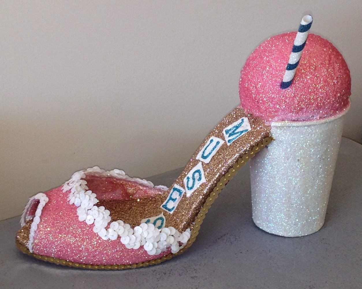
For some reason, I have no idea why, I decided this was the year I was going to completely master Snoball Shoes. I made a Snoball shoe last year (this shoe, which currently lives at Hansen's). I really, really loved the 2014 one, but thought there was still a lot of untapped potential in Snoball Shoes. My research/reference images for Snoballs are compiled on this Pinterest board.
I like the round sphere shape, but also wanted to try some foam eggs as bases to give the shoe that more conical look some Snoballs have. After some research and fiddling with foam shapes of different sizes, I've settled on these eggs and these spheres (both from Michael's):
The spheres are the 3", the eggs are 2 13/16 x 3 7/8 inches. I bought a 6-pack of the spheres so I'd have plenty to experiment with. Note that foam eggs are particularly easy to come by at Easter time, if you're shopping/planning year round. I also bought a 2-pack of slightly larger 4 x 2-5/8 inch foam eggs from Amazon and those also worked fine. The foam is denser, so it's a little tougher to carve, but more substantial.
Those sizes wound up being the best fit for the generic disposable cups I used this year:
| Doesn't look like much yet, but after plenty of glitter it will. |
So far, I've done three different Snoball Shoes for 2015. I have more details on how these were made, but things are a little crazy at the moment, so tons of pictures for now (which I think is what most people are looking for here anyways), possibly more details down the line.
The first features a nectar cream spherical snoball that most closely resembles the 2014 shoe:
The pink of the snoball and the foot of the shoe is Martha Stewart in color "cotton candy" (which, to me, looks just like nectar cream). The interior is Recollections "champagne," the sole is Recollections "rasspberry" (though it doesn't show in the pictures). I made the straw blue and white striped as a nod to the Defend New Orleans snoball shirt. I may add more to the cup so it isn't so plain, and this still needs the year added (probably on the foot).
Next up, a cone-shaped Rainbow snoball. I wanted to pick another flavor that was recognizable besides Nectar Cream, and thought this could look pretty (I pinned a bunch of reference images for rainbow snoballs/snowcones/etc.)
The interior of the shoe is Recollections "peacock" and the foot is ArtMinds stackable. For the cup, I did a glittery version of this paper solo cup. I glittered a white straw and white spoon handle to complete the look. I don't think I completely nailed the effect of a rainbow snoball, I'll keep experimenting with it (maybe I'll attempt a Hansen's Creambeaux next?)
The last one is the least literal/most interpretive of the 2015 Snoball Shoes, in the sense that it doesn't really look like any snoball you've ever ordered. It's meant to be an interpretation of the Hansen's sign (lots more pictures on the Hansen's Facebook Page), which is also the artwork on the Dirty Coast Hansen's shirt (We are big, big fans of Dirty Coast...I already have this onesie for my baby, even though we don't live in NOLA right now). I really wanted to try and recreate that gorgeous color gradient on the snoball:
| Reference images of the inspiration for this shoe |
| The finished shoe |
I tried to create the textured effect of the sno-bliz in the poster, so I added waves of silicone caulk. This is what the base shoe looked like before glittering (I primed the shoe with which spray paint, and stuck the umbrella and cherry on there to get an idea of what the final effect would be):
The gold of the cup and foot are Martha Stewart "yellow barite." I did the lettering in blue and green to match the cup on the Dirty Coast shirt (though I replaced "PARTY" with "MUSES" and "BLIZ" with "2015"). When the sign and the Dirty Coast image differed, I generally chose the Dirty Coast version: I used the New Orleans flag rather than the American flag, and included purple/pink towards the bottom of the snoball rather than just orange). I made the flag out of foam and a toothpick, the umbrella is a little cocktail umbrella that I trimmed down. The cherry is a red glitter sphere that I added a glittery green stem to:
| Shoe from the back showing the cup lettering |
To get the shading right on the snoball itself, I used five shades of iridescent glitter, and mixed four additional custom blends for the transition areas (9 colors total). The interior and sole are both Martha Stewart, but I don't recall the color names.
Now that it's done, I think I could've gone a lot more dramatic on the texturing, although I do love the way the coloring came out - like a glittery sunset!
I also wish I'd chosen a shoe with a less "busy" design (I worry that the crazy snoball with all it's colors and embellishment fights a little with the dramatic strappy foot). But overall, a very fun, very productive experiment.
Here are some group shoots, mostly because I'm pretty proud of these:
154 days until Muses 2015!!
Sunday, August 10, 2014
Updates and WIPs
Less than 200 days until Mardi Gras 2015 and 185 days until Muses 2015, by my count (which is this countdown, minus 5 days).
Of course for me the work window is a little narrower: my due date is about a month and change away. So onwards with the glittering!!
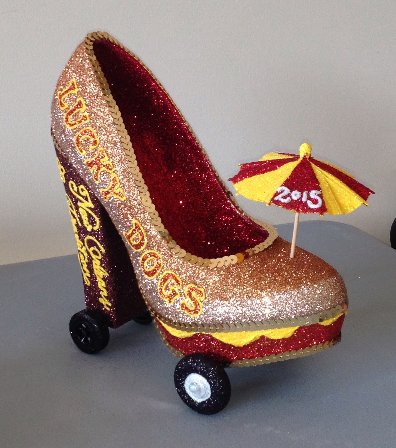
The Lucky Dog Shoe is now on wheels!!
The front wheels are wooden craft wheels from Michael's (these, or something quite close/) and the back wheels are from a Pine Car derby kit glittered in Martha Stewart "onyx" with white paint and glitter on the front wheels. These don't roll freely (the axels are glued to the bottom of the shoe), but I'm thinking about re-doing them so the shoe can roll. Too far? Possibly.
And here's a collection of shoes that are all approx. 80-90% finished (glittering and finishing is more or less done, still need "Muses" and "2015" written on them and some extra touch-ups/detailing). As a bonus, none of these are food-related so I can feel a little less silly about my theme choices this year.
This one I call the Mermaid Treasure shoe:
The teal on the exterior of the shoe is Recollections "Paradise. "Recollections makes two teals: "Paradise" and "Peacock." I love both, but "Peacock" is a little bluer and "Paradise" is a little greener. The interior (which you can't really see) is Recollections "Champagne" and the sole and heel are ArtMinds stackable purple. I was going for a teal and purple color scheme to invoke the aesthetic of the Sirens of New Orleans (it's also a slightly darker-hued/more jewel-toned version of The Little Mermaid's color scheme). Edges were lined with a gold braid, which while not glittery I thought might give the shoe a more nautical vibe than sequin trim would've. My mermaid shoe research is on this Pinterest board: Mermaids and Sirens.
For a while now, I've been bookmarking art shoes where the interior of the shoe is sort of used as a vase and completely filled up, often with flowers and often as (I'm assuming) a centerpiece. If you're curious about examples of what I'm talking about, see this Halloween centerpiece, this flower and feather filled hot-pink shoe or this sort of Victorian-esque piece
I wanted to completely fill the shoe like an overflowing treasure chest. To keep the weight down, I filled the shoe interior with a base layer of little purple glittery foam balls (I wasn't sure how much they're show in the finished so, and the answer is they don't really), then layers shells on top. I had a pretty decent collection of shells, both personally gathered and store-bought, so I mixed in a couple different types and hot glued them into place. I also added a few pearls (from a strand of beads) and some sprigs of glittery "seaweed" which I bought when Michael's Christmas stuff went on sale last year (they have a really wide range of floral decor at Christmas time so it's entirely possible to pick things up that can be repurposed into something not particularly Christmassy).
So, she's done except for lettering, and maybe a little more embellishment.
Here's another shoe in the category of me experimenting with filling up the entire entire of the shoe, which I call The Golden Goddess Shoe:
Moving along, here's my a Frozen-inspired shoe:
Hope everyone's glittering/planning/dreaming of shoes is going swimmingly! I can't wait to see what people share for 2015 (though I really a lot of that sharing probably won't happen until later in the year/closer to Mardi Gras...*sigh*)
Next post will be about Snoball shoes, including some how-to tips, so check back!
Of course for me the work window is a little narrower: my due date is about a month and change away. So onwards with the glittering!!
The Lucky Dog Shoe is now on wheels!!
The front wheels are wooden craft wheels from Michael's (these, or something quite close/) and the back wheels are from a Pine Car derby kit glittered in Martha Stewart "onyx" with white paint and glitter on the front wheels. These don't roll freely (the axels are glued to the bottom of the shoe), but I'm thinking about re-doing them so the shoe can roll. Too far? Possibly.
And here's a collection of shoes that are all approx. 80-90% finished (glittering and finishing is more or less done, still need "Muses" and "2015" written on them and some extra touch-ups/detailing). As a bonus, none of these are food-related so I can feel a little less silly about my theme choices this year.
This one I call the Mermaid Treasure shoe:
The teal on the exterior of the shoe is Recollections "Paradise. "Recollections makes two teals: "Paradise" and "Peacock." I love both, but "Peacock" is a little bluer and "Paradise" is a little greener. The interior (which you can't really see) is Recollections "Champagne" and the sole and heel are ArtMinds stackable purple. I was going for a teal and purple color scheme to invoke the aesthetic of the Sirens of New Orleans (it's also a slightly darker-hued/more jewel-toned version of The Little Mermaid's color scheme). Edges were lined with a gold braid, which while not glittery I thought might give the shoe a more nautical vibe than sequin trim would've. My mermaid shoe research is on this Pinterest board: Mermaids and Sirens.
For a while now, I've been bookmarking art shoes where the interior of the shoe is sort of used as a vase and completely filled up, often with flowers and often as (I'm assuming) a centerpiece. If you're curious about examples of what I'm talking about, see this Halloween centerpiece, this flower and feather filled hot-pink shoe or this sort of Victorian-esque piece
I wanted to completely fill the shoe like an overflowing treasure chest. To keep the weight down, I filled the shoe interior with a base layer of little purple glittery foam balls (I wasn't sure how much they're show in the finished so, and the answer is they don't really), then layers shells on top. I had a pretty decent collection of shells, both personally gathered and store-bought, so I mixed in a couple different types and hot glued them into place. I also added a few pearls (from a strand of beads) and some sprigs of glittery "seaweed" which I bought when Michael's Christmas stuff went on sale last year (they have a really wide range of floral decor at Christmas time so it's entirely possible to pick things up that can be repurposed into something not particularly Christmassy).
So, she's done except for lettering, and maybe a little more embellishment.
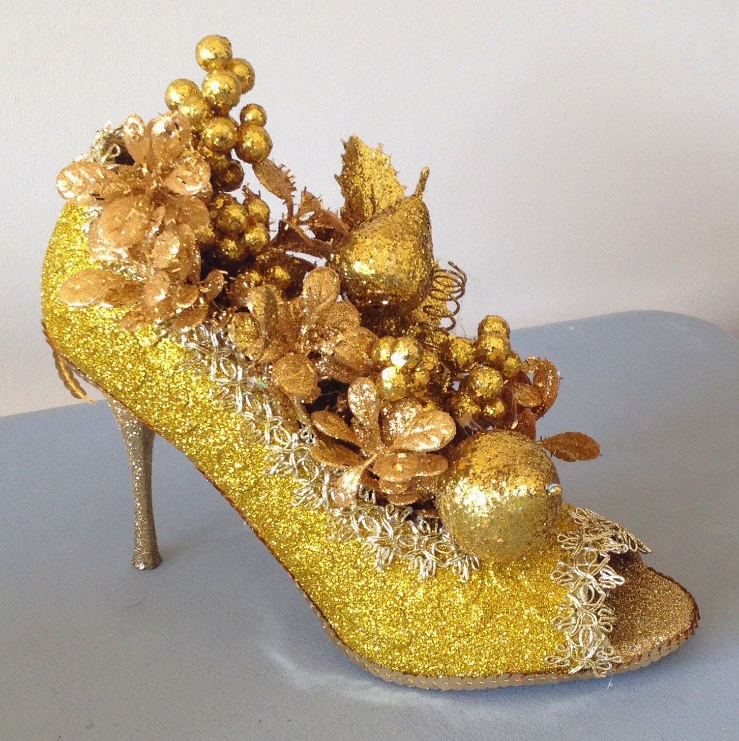
Here's another shoe in the category of me experimenting with filling up the entire entire of the shoe, which I call The Golden Goddess Shoe:
As described above for the glittery seaweed, I picked up some glittery gold branches in the Michael's post-holiday clearance that I thought didn't look too Christmassy and might be repurposed. I thought on a monochromatic shoe the effect might be more mythological.
The shoe is glittered in several different shades of gold: Martha Stewart on the exterior, ArtMinds on the heel and sole and Recollections on the interior.The edges are lined with gold sequin along the bottom and a wider looser almost lace like gold trim I had in the stash on the upper edge and open toe edge. Then the shoe is filled with different shades of golden leaves, vines, branches, fruit and berries (all of which was Christmas clearance). I'm going for a Greek myth vibe, some kind of hybrid of the King Midas myth and the Golden Apple from The Judgement of Paris. Still needs "Muses" and "2015," which I'll probably do in that angular Greek font.
Here I was really playing with layering sheers to see what kind of effects I could get. I was also experimenting with the Recollections tinsel glitter, which I hadn't ever tried on a shoe before. Jazz Fest made me a little braver with texture this year - I don't usually stray from ultra-fine glitter because I haven't really had great experiences with the super cheap chunky stuff in the past, but I think that made be an issue with the low quality of the chunky glitters I was using: there was some really cool use of textured glitters at the Muses demo at Jazz Fest.
The exterior is several coats of Recollections tinsel glitter in "Frost." The base shoe was a pale taupe and I thought I could get away ignoring my own advice on translucent/pale glitter and just skip priming with white spray paint. I WAS WRONG. It took twice as many coats to get an effect I was happy with. The interior and heel are Recollections "peacock" covered with the much more sheer, iridescent Martha Stewart "blueberry slush." The sole (which doesn't really show in the pictures) is Recollections "bling" (a mirrored iridescent silver) covered with Jefferson Variety iridescent white glitter. The layering gives a nice icy effect.
The trim around the top edge is a white sequin trim that I thought looked nice and snowy and the bottom edge is teal sequin trim. I made a teeny little snowman for the shoe out of two small glittery white foam balls with sticks for arms (glittered with Martha Stewart "brownstone"), a toothpick piece for the carrot nose (glittered with Martha Stewart "copper") and little black glitter facial features drawn on with Scribbles puff paint and glittered in Martha Stewart "onyx."
Still needs lettering, and I'm trying to decide what else this shoe might need...
Hope everyone's glittering/planning/dreaming of shoes is going swimmingly! I can't wait to see what people share for 2015 (though I really a lot of that sharing probably won't happen until later in the year/closer to Mardi Gras...*sigh*)
Next post will be about Snoball shoes, including some how-to tips, so check back!
Monday, July 28, 2014
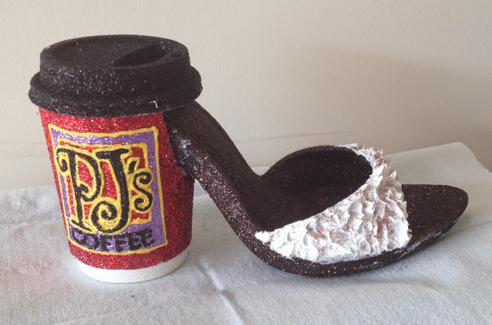
PJ's Coffee Shoe
For this shoe, I used the same general approach that I used on the 2014 Shoe Bliz shoe, I converted the back half of a shoe (the heel area) to a to-go coffee cup with lid. I glittered the main body of the shoe with a nice dark coffee brown (Recollections, color "espresso") then decorated the to go cup as a PJ's coffee cup. The red is Recollections "cherry." The black lid is Martha Stewart "onyx" and the white glitter on the bottom is probably ArtMinds (I have about 4 different brands that I use interchangeably when I need white glitter).
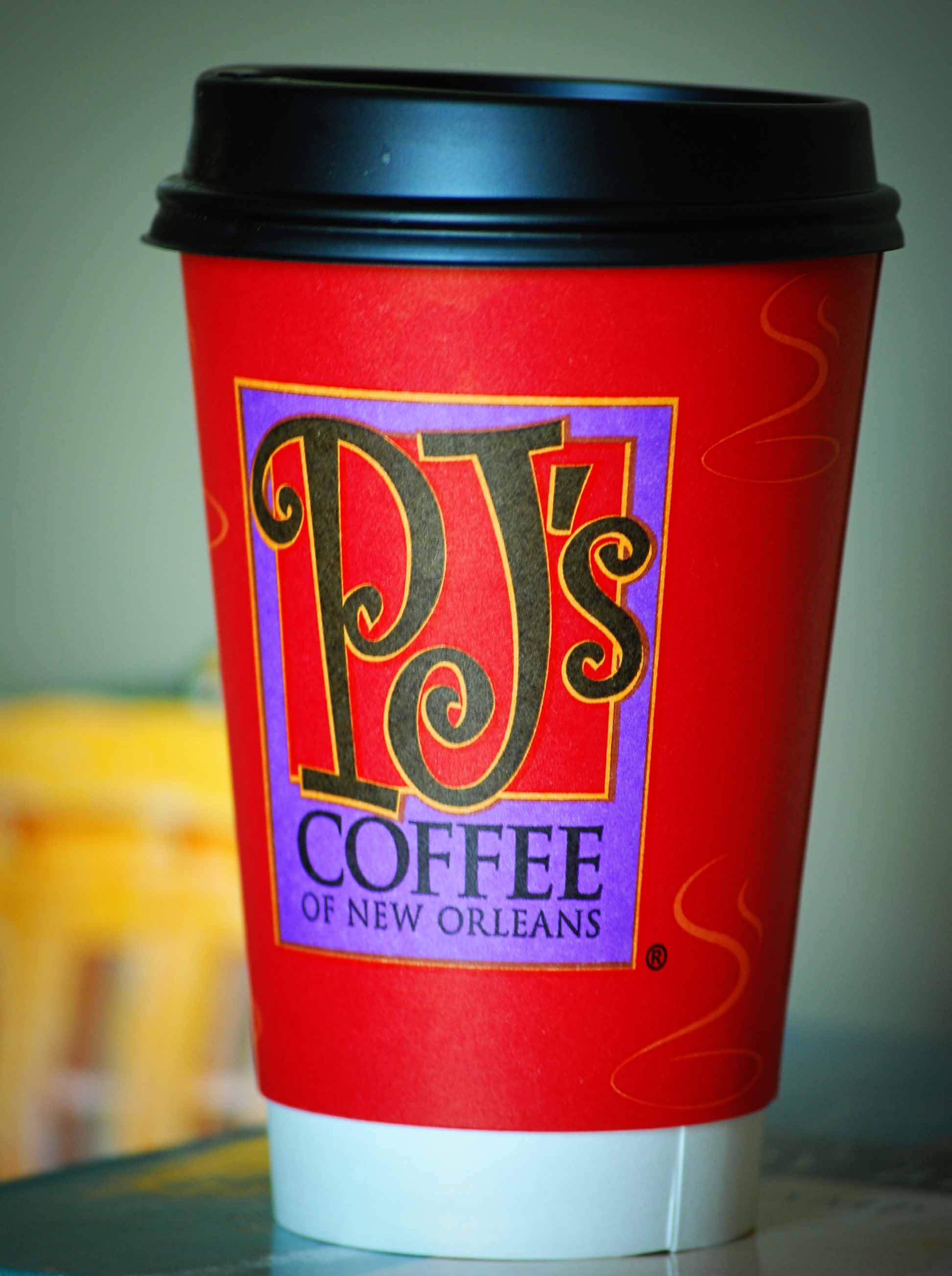
For the logo I traced and transferred using my go-to technique and did it in two pieces (the PJ's letters and the box). The purple is Martha Stewart "charoite." The yellow in the logo came out a little exaggerated because I could only get the lines so thin (I used WOW! brand "sunflower" over yellow Scribbles paint). I would've liked to have gotten the logo tracing a little cleaner, but it should still be recognizable. There are two logos on the cup, one on each side:
I covered the arch across the top of the shoe with some "whipped cream" (silicon based caulk) sprinkled with "cinnamon" (Martha Stewart "copper").
I got the idea to use silicon caulk to create texture from the DIY slice of cake postcards and I am having so much fun playing with it. I can't wait to share some of my other experiments with it here.
2015 Fried Shrimp Poboy Shoe
I've had this Robert Tabor sandwich flipflop pinned on my inspiration shoes board for quite a while now and finally got around to making one this year. I liked the sandwich concept and loved the idea of using flip-flops for something because I like to try a shoe-shape outside of my traditional pump comfort zone and flip-flops are super cheap (this pair was like $1 at Michael's). I did think I could make it more New Orleanean, so instead of just a sandwich I went with a nice iconic fried shrimp poboy. I should also point out that Mary Ross totally beat me to the punch on this one, making an awesome roast beef poboy Nyx purse last year.
I started out by making some paper mache shrimp to stuff my poboy. I used paper towels, Elmer's glue and pink tissue paper:
| Here are my shrimp before "breading and frying" |
For lettuce, I bought some pale green tulle (same as I used to make the ruffle on the KaleGate shoe, but a different shade). The tulle was already a little glittery, but I also added some extra glitter (Martha Stewart, "limeaid"). Adding glue to the tulle to apply the glitter also allowed me to add some more naturalistic creases and wrinkles in the lettuce.
For the tomatoes, I cut circles out of foam (I traced the same circle six times, but didn't worry about following the lines too closely when I cut them out so they would seem more real). The tomatoes are Martha Stewart "carnelian" with Tulip dark red glitter around the edge for the tomato skin. I thought about adding more detail to interiors of the tomato slices like seeds, but figured it wouldn't show when the poboy was assembled.
For the bread, I removed the strap from one of the flip-flops, then covered them both with Martha Stewart "copper." On the bottom piece, I added a nice generous smear of "mayo" (white Scribbles 3D paint with white iridescent glitter). On the underside of the top piece (with the strap still attached) I added some red glitter hot sauce (which doesn't really show in the pictures or in the finished sandwich).
Here are the finished ingredients all lined up ready to assemble:
| Fried shrimp and lettuce |
| A little more lettuce, tomato slices and bread |
| Everything lined up (I have a table just for my Muses shoes to work on now!) |
Next step, I hot-glued together the top and bottom pieces; fried shrimp went on the bottom flip-flop and lettuce and tomatoes went on the top flip flop (when I tried assembling it and the shrimp kept overflowing my husband said "don't worry, that happens on real poboys too." Sounding more and more like a native, that one...)
Lastly, I assembled the top and bottom pieces into the finished poboy:
Overall I'm pretty pleased...it's not a perfect recreation or anything, but it certainly makes me hungry for a trip to Parkway (granted, that's pretty much always the case).
Subscribe to:
Posts (Atom)